NSW COVID Stats Show it is the Jabbed who are getting sick
And the more jabs they get, the more likely they are to get a positive diagnosis
Doing the same thing over and over again and expecting a different result is the definition of insanity.
Based on that, NSW health authorities are certifiable.
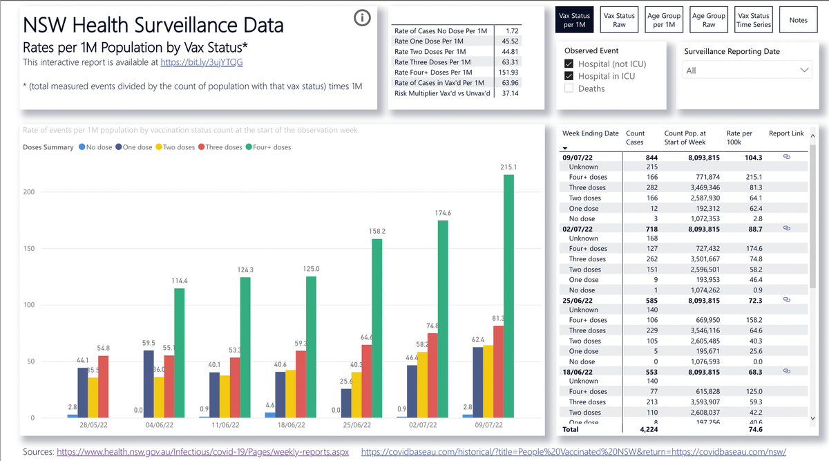
Below is a chart plotted using official NSW Health data on the rates of COVID ‘infections’ by injection status. The teal on the left are those who have not had any jabs, then dark blue is one shot, yellow is two, red is three and green is 4.
It is obvious that, instead of being a pandemic of the unvaccinated as we’ve been told, it is a pandemic of the compliant / those who were forced, coerced, blackmailed and bullied into risking their health with these experimental bioweapons.

Thank you for reading Informed Choice. This post is public so feel free to share it.