A picture is worth a thousand words...
What does this graph tell you about the COVID jab?
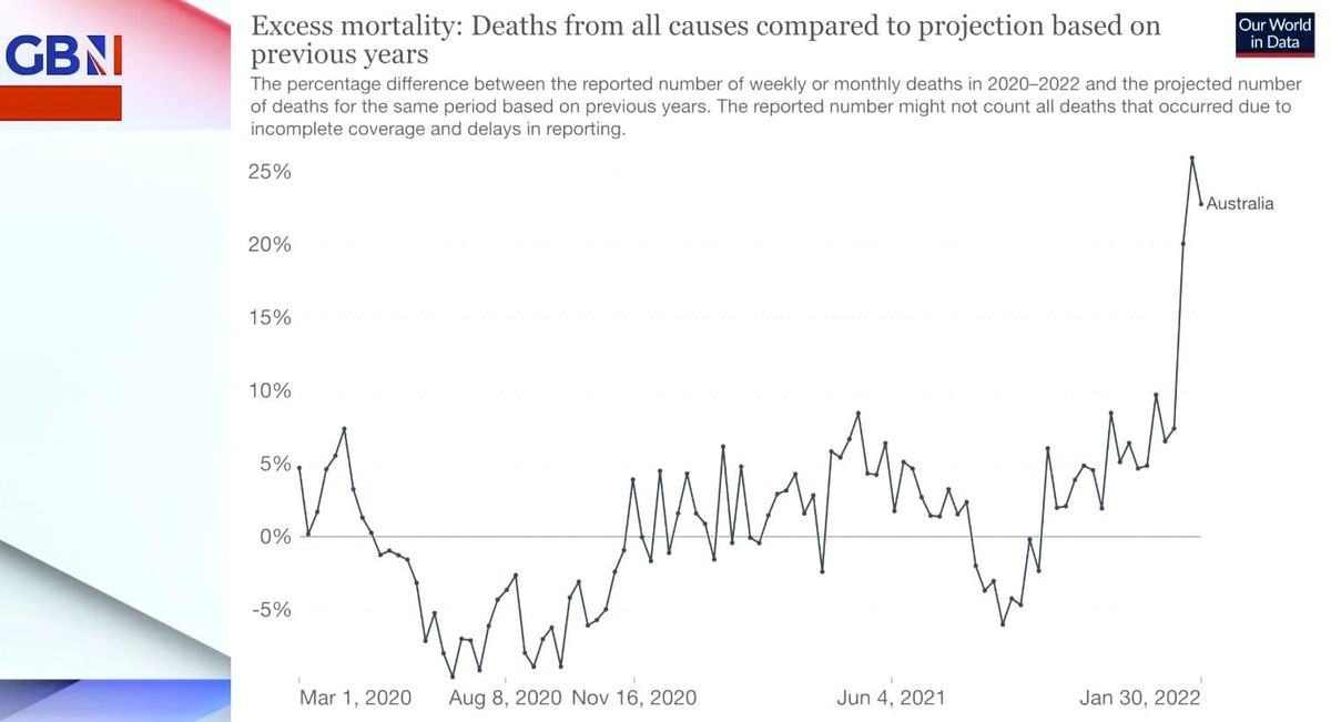
This has been one hell of a pandemic!
Excess deaths were down from the time the pandemic was declared until about the time the jab to prevent infection was introduced. And as more jabs were given, an mandates were issued, excess mortality shot up.
Either the jab is deadly or…even worse, it’s working exactly as planned.